Do you know Online Retailers Are Losing 67.45% of Sales
You’re losing money. We haven’t even met, yet I know this because the data supports it; that each and every day you’re losing potential orders on your website.
Cart abandonment causes online retailers a great deal of pain. How much pain?
For every 100 potential customers, 67 of them will leave without purchasing. How much would your revenues increase if you were capturing those sales instead of losing them?
Let’s look at a quick example. If you’re currently making $15,000/mo in online revenue and could turn just 25% of those abandoned orders into sales, you’d make an extra $45,000 each year.

Why Shopper leave without Paying??
Presented with unexpected costs: 56% of shoppers said that being presented with unexpected costs is the reason they leave without completing their purchase. You’ve likely experienced this before. You find an item you want to buy and click Add to Cart. When you decide to checkout you’re presented with additional fees and charges that weren’t clearly listed on the original product page. Not feeling so hot about making the purchase anymore you leave.
Website crashed or was too slow
Price presented in a foreign currency: Most online retailers are now accepting international orders. If you are, it’s important that you display, or provide the ability to show, what the cost will be in the shopper’s local currency.
Approaches to Reducing Shopping Cart Abandonment
There are two ways to deal with shoppers leaving your store before buying. They can be broken down into two groups:
1) Before Cart Abandonment
2) After Cart Abandonment
Before Cart Abandonment
The Before Cart Abandonment stage is simply when your customer is still on your website. While they are on your site many things can go wrong. But if you follow these steps you’ll be sure to increase the number of customers that complete your checkout process.
Here are 10 steps to make your checkout more effective:
- Show Images
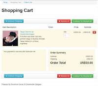
Provide clear thumbnails of the actual items the customer is purchasing. Rather than simply having text to describe what they are buying, it’s always better to show an image of the item(s).
- Display Security Logos
The Statistia study above showed that 17% of shoppers don’t purchase because they are concerned about security. In a test published by Get Elastic, an online retailer found that by placing a security badge on their site sales increased 4-6%. It’s important to note however that there are other studies that show a decrease when using these logos. So it’s important to test the placement and style when using these.
- Test Single Page vs Multi-Page Checkout
Some studies have shown single page to be more effective. Yet other retailers see better results from multi-stage. If you’re going to use multi-page checkout, be sure to include a progress bar that shows the customer how many pages there are and what page they are on in the process.
- Make Editing the Cart Easy
Shoppers don’t want to be locked in to the checkout page. If they made a mistake in their selection or need to edit it for some reason make sure it’s easy for them to do so.
- Offer Different Payment Methods
Consider offering payment by Visa, Mastercard, American Express and Paypal as well as other payment solutions depending on the audience and demographic you’re targeting. Shop no 47 saw a 15% increase in their checkout process simply by enabling the option to pay with American Express, which wasn’t offered out of the box with their payment processor.
- Offer Support
Providing a toll-free telephone number or chat box on the checkout page gives shoppers confidence and eases any concerns they have. Plus if they do have a question it’s better to have them ask it right then and there rather than leaving the site and hoping that they remember to ask the question later and come back.
- Avoid Registrations
One of the biggest turnoffs in some checkout processes is being forced to register on the website in order to complete the purchase. A study by User Interface Engineering showed a 45% increase in customer purchases when forced registration was removed from the checkout page.
- Offer Free Shipping
A Deloitte study found 69% of shoppers are more likely to shop with online retailers who offer free shipping. And a ComScore study found that 61% of shoppers would quit their order if free shipping wasn’t offered.
- Add Testimonials
Unless you’re a well known brand, credibility will be an issue for you. By displaying testimonials and reviews from customers you can help alleviate any concerns shoppers may have.
- Offer Price Guarantees and Refunds
Remember that 36% of shoppers don’t complete their purchase because of price. By offering a price guarantee you give the shopper confidence that they’ve found the best deal and have no need to compare prices with your competitors. And by having a clear and practical refund policy you’re adding peace of mind to the shopper’s experience.
After Cart Abandonment
After implementing the changes on your website it’s time to look at what you can do if the shopper still decides to leave without purchasing.We’ll now explore two of the most powerful ways to deal with abandoned carts.
Ad Retargeting
According to AdRoll, a retargeting platform, “2% of shoppers convert on the first visit to an online store. Retargeting brings back the other 98%. Retargeting works by keeping track of people who visit your site and displaying your [retargeting] ads to them as they visit other sites online.”
The above diagram from Retargeter shows how the process works. A shopper comes to your website and leaves without purchasing. You can then use a service like Google Adwords, AdRoll, or Retargeter to display the ads you choose to that shopper as they visit other sites online.
The retargeting ads you display can be as targeted as you want. If a buyer comes to your site to purchase a hat, you can have retargeting ads of that same hat show up when the shopper is on a news or music website for example, as long as those sites accept the ads – and many of the top sites online these days do.
Sample Results
Get Satisfaction used retargeting to increase their ROI 248% over a three month period. Janardhan Silks, a fair-trade fashion retailer, was able to get 30% of non-converting visitors to return to their website through retargeting.
Email Recovery Campaigns
Another way to get shoppers back to your store to complete their order is through email recovery campaigns.Here’s how it works: You setup personalized emails that get sent to the shopper if they don’t complete their purchase.
If you’re using a multi-page checkout it’s easy to get the shoppers name and email address upfront.
You then create a series of 1-3 emails that will get sent out to that shopper at set intervals after they have abandoned the cart and left your site.
The emails should include: Pictures of the item they selected, Reviews or testimonials from other shoppers, Guarantee and refund policy information, A strong call to action to get them back to your site
Timing the emails: 1st email – should go out within 24 hrs, 2nd email – send within 2 days, 3rd email – send within 1 week
Retail Insights Solutions:
- Offline Marketing
- Messaging advantages of online and buying directly from manufacturer by giving discounts
- Contacting end customers directly or through intermediates
- Partnership with communities – e.g. with associations
- Ad-retargeting
- SEO & Best Practices
- Online Marketing
- Google ads
- Facebook campaigns and building online community, E-mail Recoveries
- Designing new themes on the website etc.
Stop Leaving Money on the Table
Many online retailers are losing money each and every day due to cart abandonment. By implementing the techniques and tools you’ve learned about in this article you can get more shoppers to complete your checkout process the first time. And if they do decide to abandon cart, and some always will, you’re well equipped to get them back to your website to complete their purchase. Put these ideas to work and you’ll be well on your way to increase your store’s sales.
Contact: sales@theretailinsights.com ||+91 77950 01231
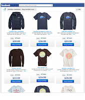
 Many retailers are considering whether or not to develop an e-commerce offering into their Facebook presence. If that’s you, you’ll be in good company as brands big and small have all seen the advantages of Facebook commerce.
 I had our storefront with one product set up within 15 minutes.We also highly recommend the following


